

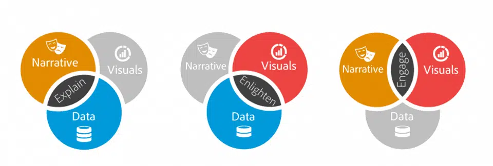
In a recent study on Data Journalism, Google partnered with PolicyViz to understand how journalists are using data to tell stories. The study covering US, UK, and Germany found that 42% journalists use data regularly (at least once or twice a week) to tell stories. Data Storytelling begins at the intersection of data, visuals, and narrative.
News organizations are now setting up a dedicated team of data journalists to cover stories in politics, finance, and investigative journalism. Using data storytelling requires extensive training and knowledge of tools.
People hear statistics, but they feel stories.
Data storytelling has been proven to be effective when it comes to memorability, persuasiveness, and engagement. So how do you get started with data storytelling and are there any best practices that data journalists follow?
Data Storytelling Best Practices
What’s the Story
In any form of storytelling, you start with the intent of telling a good story. In case of data storytelling, you started with a ‘data ask’ much like a thesis statement on paper. To prove your hypothesis you need to back it up with facts and data.
The story should have a clear narrative arc which includes exposition, rising action, climax, falling actions, and denouncement. Without data to support your story, it will crumble.
Interactive Studio Klin partnered with UCL Energy Institute to visualize shipments across the world. To develop the map UCL gathered related to location and speed of ships and cross-checked it with another database to get the vessel characteristics, such as engine type and hull measurements. They computed this data with CO2 emissions for each observed hour, following the approach laid out in the Third IMO Greenhouse Gas Study 2014.
The team at Kiln took the resulting dataset and visualized it with WebGL on top of a specially created base map, which shows ocean depth, continents and major rivers. The initiative won Kantar’s Information is Beautiful Awards for 2016.
Choose the visualization
Once you have identified your story, you need to find the right visualization for the job. The form should be led by your data ask and conclusion. Are you showcasing the difference between overtime, categories or location? If you are showcasing geographic locations, it is better to represent them on a map. Multiple visualizations forms can be combined to enhance the detailing and showcase complex data points.
Brevity in Visualization
Presenting data in a non-deceptive and non-cluttered manner is an art. The litmus test for checking brevity is to check whether the viewer could absorb the crux of the story without you explaining it to him.
There are two parts to getting this right.
Picking the right graph to represent the data.
Designers usually, focus more on the visuals when it comes to data storytelling however you can add text or voice over (in case of interactive graphs) to guide the storytelling process.
Placement of the axis.
If you are using a bar graph to showcase difference then it usually okay to start the axis at zero. Placing the axis at zero allows you to show the full size of the bar. In case of line graph as the objective is to showcase increase or decrease over time and not the absolute size its an accepted practice to not to place the axis at zero. If you are showcasing multiple trends using a line graph, then the axis needs to be consistent.
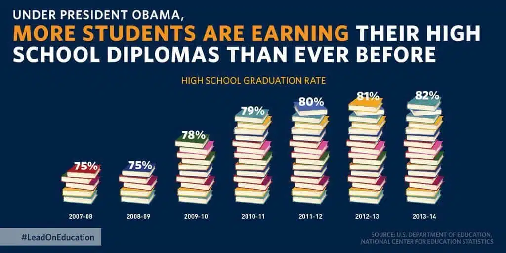
White House released a chart to showcase increase in high school graduation rate in the US for 2016. There are multiple issues with the above bar graph. First, the axis should start with zero because if you were to remove the bottom half of the image the proportion is lost. Secondly, its never a good idea to illustrate elements of a chart. From the viewer’s standpoint does it mean five books equal to 75% and sixteen books equal to 82%.
Design for your Audience
The visualization needs to be developed based on the level of information that the audience already knows. If the information is going to be consumed by a novice then you will need to detail out the basics. For an expert, the visualization has to be more exploratory and detail oriented.
Move Them
With data, your objective is to bring something new to the viewer that they have not seen before. If your story moves them and makes them act on the insights provided then you have succeeded with your story. To mark the 100 years of commercial flight The Guardian UK partnered with Flightstats and Klin to create an interactive map that shows the history of aviation since 1914. The result is a stunning interactive map that reminds you of the progress we have made when it comes to flying.
